Thứ Ba, 4 tháng 10, 2011

Bill Watterson’s College Comics

Online College Courses has assembled a list of top ten college comic strips:


 “What did Bill Watterson do before creating the beloved Calvin and Hobbes? He drew cartoons for his college newspaper, of course. As a student at Kenyon College, his work appeared in The Kenyon Collegian, revealing a well defined style even in his early years as a comic. Be sure to check out the collection of his college work and enjoy a slice of 70′s American college life.”

More samples of Watterson’s college work at Comics Alliance
Online College’s list of Top Ten College Comics

Thứ Hai, 3 tháng 10, 2011

How to turn a girl into Abe Lincoln

Instead of using the Gallery Flambeau to get rid of a sub-par oil study, I painted over it.


I started with a fairly thin, dry scumble to partially cover the old paint. Then I drew the new subject with a brush. Then shadows, halftones, reflected light, and background.

Painting a new study of an old one is an old tradition. Sargent did it often with his oil landscapes. One reason for doing this (apart from being a cheapskate and reusing old panels) is that the old painting suggests random colors and textures that are fun to build over.

One caution. For finished work, it’s not really conservationally sound because of the risks of pentimenti, but it’s OK for studies.

This was a sample demo for my recent workshop on painting in colored light.
-----
Previously: Painting in Colored Light
Gallery Flambeau

Chủ Nhật, 2 tháng 10, 2011

14-year-old artist

This watercolor was painted by a 14-year-old artist. Any guesses who?
-----
Addendum: Congratulations to Connor de Jong of the Water Street Atelier. You've got it. It’s John Singer Sargent  (American, 1856–1925) from his "Splendid Mountain Watercolours" Sketchbook, 1870. Sheets: 11 x 16 in.


Link to the Met website, where, thanks to an intuitive image interface, you can scroll through the image and see amazing closeups of all his works in the collection.
 Charley Parker of the blog Lines and Colors calls it: "likely the best major art museum website in the world."

LA Lectures This Week

Just a reminder to those of you in Los Angeles. I'm heading out there today for a series of lectures, and there are still spaces available at the two public ones, Korpus and LAAFA. Please note that the two lectures cover different topics:


Wednesday, October 5, 7PM-10PM
LAAFA Los Angeles Academy of Figurative Art
This lecture looks at composition in a completely new way, beginning with what we know about how we look at pictures from current eye tracking data. We then look at storytelling and how that influences design decisions, and we concentrate a lot on tonal organization, one of the most important elements in good composition.

The workshop will also include a "Q&A"discussion, a demo of various composition sketching and observation sketching techniques. Book-signing to follow.
Tuition: $75. Open to all levels.

Los Angeles Academy of Figurative Art
16926 Saticoy Street
Van Nuys, CA 91406
818.708.9232
More info at their website
----------------
Thursday, October 6, 7PM-10PM
Korpus School of Art + Gallery
“Imaginative Realism: How to Paint What Doesn’t Exist” + “Color and Light in the Landscape.” Even if you’ve got the books, these talks go deeper, and the color talk will emphasize what landscape painters need to know. I’ll answer questions and do a quick demo of the watercolor pencil sketch technique. Book-signing to follow.
Tuition: $75. Open to all levels.

Korpus School of Art + Gallery
1300 Factory Place, Unit 308
Los Angeles, CA 90013
Email: korpus.info@gmail.com
Phone: 213-228-2014
Web: www.korpus-la.com
 --------------------

Thứ Bảy, 1 tháng 10, 2011

Part 5. Fire & Ice: Living inside Paintings

You can probably see foreshadowing of Dinotopia in some of the backgrounds I did for Fire and Ice.


I enjoyed the camaraderie of the movie studio, and I have missed that feeling since. Every couple weeks Tom and I brought in a three-foot high stack of art books from the library and spread them out on the counters in the background room. One by one all the animators and layout people would come by during the breaks and we’d fire up about art and look through each other’s sketchbooks.


Once in a while we would cram paint lids into the regulators of the oxygen airbrush tanks and shoot the lids across the room like a cannon, right through a foam-core target of Mickey Mouse.

At the end of the production, the animators packed up their things and moved on like gypsies to other projects at other studios. Bakshi Productions shrunk down to just a small crew. The effort shifted to editing, sound, and and marketing. But there were still just a few background paintings to finish.


At Bakshi’s request, I brought them home to finish in my own apartment in Highland Park. It was lonely working on those backgrounds at home instead of in the studio.

One thing I loved about the film work was the feeling of living inside my paintings. It was always  a charge to assemble in the editing room and watch the dailies. When I saw my pictures projected on the screen with action and music, it really felt like I was inside the world I was painting, not just looking at flat compositions. Howard Pyle always talked about jumping through the picture frame and breathing the air you just painted, and that was the first time I completely experienced that feeling.

I never saw the movie during its theatrical release because I was traveling at the time, and it came and went quickly. Maybe it will get a boost from the live action reboot.

Blog reader Kurt asked what ever happened to all those original backgrounds. A few of them were sold in galleries, I understand that a few survive in private collections, but most are lost. Ralph Bakshi told me last year that they were all destroyed at some point when they were being transferred from one indifferent holding corporation to another.


That’s the story of filmmaking. It’s a hard-won battle to assemble people and materials for a moment in time, in order to cast a few shadows on a wall. When it’s all over, there’s nothing left but the shadows.
--------------
All backgrounds copyright Ralph Bakshi Productions. Thanks, Ralph and the rest of the crew! And best wishes to Robert Rodriguez and the Reboot Gang.
Fire and Ice, Part 1: Rekindled
Fire and Ice, Part 2: Frazetta
Part 3: Fire and Ice -- Tom Kinkade
Part 4: Fire and Ice -- Ralph Bakshi

Wikipedia on the original Fire and Ice. 

Thứ Sáu, 30 tháng 9, 2011

Part 4: Fire & Ice: Ralph Bakshi

The animated film Fire and Ice was made by first filming actors on a sound stage, then using the resulting frame-by-frame photographs as reference for the animation.


 The animators didn’t exactly trace the photos. They found all sorts of ways to enhance and exaggerate the action, and there were a lot of giant lizards and pterosaurs that had to be completely hand drawn.


This rotoscoping process was kind of an ancestral analog version of the digital motion capture methods used nowadays on Avatar and the new Planet of the Apes. Director Ralph Bakshi had developed his rotoscope technique on American Pop, the film he produced and directed before Fire and Ice.


(video link  Thanks, David)   Bakshi oversaw all the staging and blocking of the scenes and worked closely with the actors on the set. In this making-of video, note Ralph beside the actor at 1:15. Tom Kinkade and I appear briefly toward the end of the film at 5:23.

Bakshi was fun to be around, always razzing us, drawing cartoons, and talking art. The building didn’t have a proper intercom system, so he’d yell into the ventilation system: “COFFEE!”

I was near a vent, so I yelled back, "NO COFFEE." He responded, "GET TO WORK, SLAVES!"

Ralph invited me to the set during one of the days of shooting and I did some sketches of cast and crew, but I can’t seem to locate that sketchbook.

The backgrounds were planned by layout artist John Sparey and drawn out in pencil by background layout Tim Callahan (who appears at 4:37). Though most of my time was taken up with painting the backgrounds, I sometimes contributed design work. We were all stumped by what the throne of Nekron, the ice king, should look like.


I went home and sculpted a wax maquette inspired by the Laocoön. Nekron seemed like sort of a tortured fellow, so an image of a gargoyle wrestling with a giant snake seemed to fit him. After using the maquette for reference I put it in the back of my car and forgot about it. On a hot day and it half-melted into a pathetic lump.

Tomorrow I’ll wrap.
Other posts in this series:
Part 1: Fire and Ice -- Rekindled
Part 2: Fire and Ice -- Frank Frazetta
Part 3: Fire and Ice -- Tom Kinkade
Part 4: Fire and Ice -- Ralph Bakshi
Part 5: Living Inside Paintings

Wikipedia on Rotoscoping
Wikipedia on Ralph Bakshi

Wikipedia on the original Fire and Ice. 

Thứ Năm, 29 tháng 9, 2011

Part 3. Fire & Ice: Tom Kinkade

The other background painter on the movie Fire and Ice was Tom Kinkade (misspelled Kincade in the credits). This was several years before he became Thomas Kinkade, “The Painter of Light.” At the time I knew him he was painting gritty city scenes and Indian teepees. 

 
That’s me on the left and Tom on the right, working at Ralph Bakshi’s animation studio in Burbank, California, I believe in 1981.
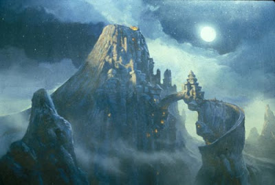

Here’s the painting I have on my board in that photo, an establishing shot of “Fire Keep,” the castle of the good guys in the movie.

Tom and I had been assigned to each other as freshman roommates a few years earlier in 1976 at the University of California at Berkeley. He headed down to southern California to go to Art Center College of Design, and I followed there later.

At the point where we started at Bakshi Studios, we were each 21 years old. He had a lot more painting experience than I did, having painted hundreds of canvases since he was in grade school. I had drawn a lot, but hardly painted at all.

To answer Arnaud’s question yesterday, we walked in Bakshi’s door together and sold ourselves as a background painting team. But my skills sucked at the time. Tom helped me get the job, and I learned a lot by watching him paint. We had to match styles so that the backgrounds were interchangeable. So you might describe the Fire and Ice background style as by “Gurkinzetta.”

OK. Stories. One thing about Tom and me was that we both enjoyed pulling off practical jokes on the rest of the crew. Once, when the production coordinator came by to check on our progress, I grabbed a razor blade and start scraping the paint off the porcelain palette. I had made a fake thumb out of latex and I filled it with red paint.


Just when I turned around to tell her that the backgrounds were coming along fine, I pretended to slice off my thumb. The chunk of thumb bounced over on the floor next to her feet. She threw down the backgrounds she was holding and screamed. We took turns doing this stunt on just about everyone on the crew.

Tom and I were always thinking of how we could create an interesting diversion for the animators. They slaved away for countless hours in their dark cubicles, bored out of their minds, looking around for any distraction.

We found a roll of brown paper and unspooled a 100-foot-long piece. Tom grabbed the front end and I grabbed the back end. He started down the hallway, dragging the long piece of paper, and I followed along way behind. We snaked that piece of paper through all the hallways, past the open doors to the animation rooms.

The animators looked up from their work and waited and waited for the piece of paper to go by. It was a long time before I came along holding the tail end, waving and saying, “Long pan shot!”


All of our paintings were done in cel-vinyl acrylics, the same paints they used for painting the cells.  They are remarkably small. Most are about 9x12 inches. This establishing shot of Nekron's glacier was about 11x14 inches.

 
Cel-Vinyl acrylic is very opaque and great to work with, but it it clogged the airbrushes, and it destroyed the Winsor and Newton Series 7 brushes that we used. Those brushes were beautiful and expensive, and I felt bad that they only lasted a few weeks. But we were each on a quota of 11 finished paintings a week.

Other posts in this series:
Part 1: Fire and Ice -- Rekindled
Part 2: Fire and Ice -- Frank Frazetta
Part 3: Fire and Ice -- Tom Kinkade
Part 4: Fire and Ice -- Ralph Bakshi
Part 5: Living Inside PaintingsWikipedia on Thomas Kinkade
Wikipedia on the original Fire and Ice.
Cartoon Color Cel Vinyl official site