Chủ Nhật, 21 tháng 8, 2011

Your mother was right,

The sensors in your eye that respond to dim levels of illumination are called the rods, and they depend on an extremely light-sensitive chemical called rhodopsin, which contains Vitamin A.

This vitamin is found in strong quantities in sweet potatoes,  spinach, fruit, and yes, carrots. Eat those carrots! They really do help your vision.

Quiringh Gerritsz van Brekelenheim (b. Dutch, 1622 -1669) Vegetable Stall,1656. Image from Food in the Arts

Thứ Bảy, 20 tháng 8, 2011

Book Review: Digital Matte Painting Handbook

I recently received a copy of David Mattingly’s recent how-to book on matte painting called The Digital Matte Painting Handbook. As a longtime fan of any kind of cinematic illusion making, I was eager to read it.

Matte painting has changed quite a bit in the last twenty years, going from painted glass to 3D animated digital environments and Mattingly has stayed on the cutting edge of those changes.

The book comes with its own teaching DVD. It fills an important void in the field of instructional books on the topic, becoming the essential guide to the modern practice of creating cinematic matte illusions.

David Mattingly’s experience makes him the ideal author. He began his career with traditional painting skills, apprenticed to the great masters of hand-painted methods, such as Peter Ellenshaw.

When digital tools began to emerge, he was an early adopter. He worked for many years as an illustrator of the Animorphs books, one of the early books to use digital illustration techniques.

He has stayed ahead of the curve with both 2D and 3D techniques, applying his professional expertise in an impressive array of movies.


To top it off, he is a clear writer and sympathetic teacher with years of classroom experience, teaching matte painting now at the School of Visual Arts and Pratt Institute in New York.

The book presents the reader with a series of problem-solving challenges and specific tasks, one being a a Scottish castle on top of a bluff overlooking the sea.

Everything is well illustrated at each stage. It’s loaded with everything from aesthetic principles to practical tips and tricks, guiding the reader step by step into an exciting field of movie artistry.

LINKS and RESOURCESThe Digital Matte Painting Handbook
Book on the visual history of matte painting:  The Invisible Art

More about the book from the author on Matte Painting.org
David Mattingly's website

Thứ Sáu, 19 tháng 8, 2011

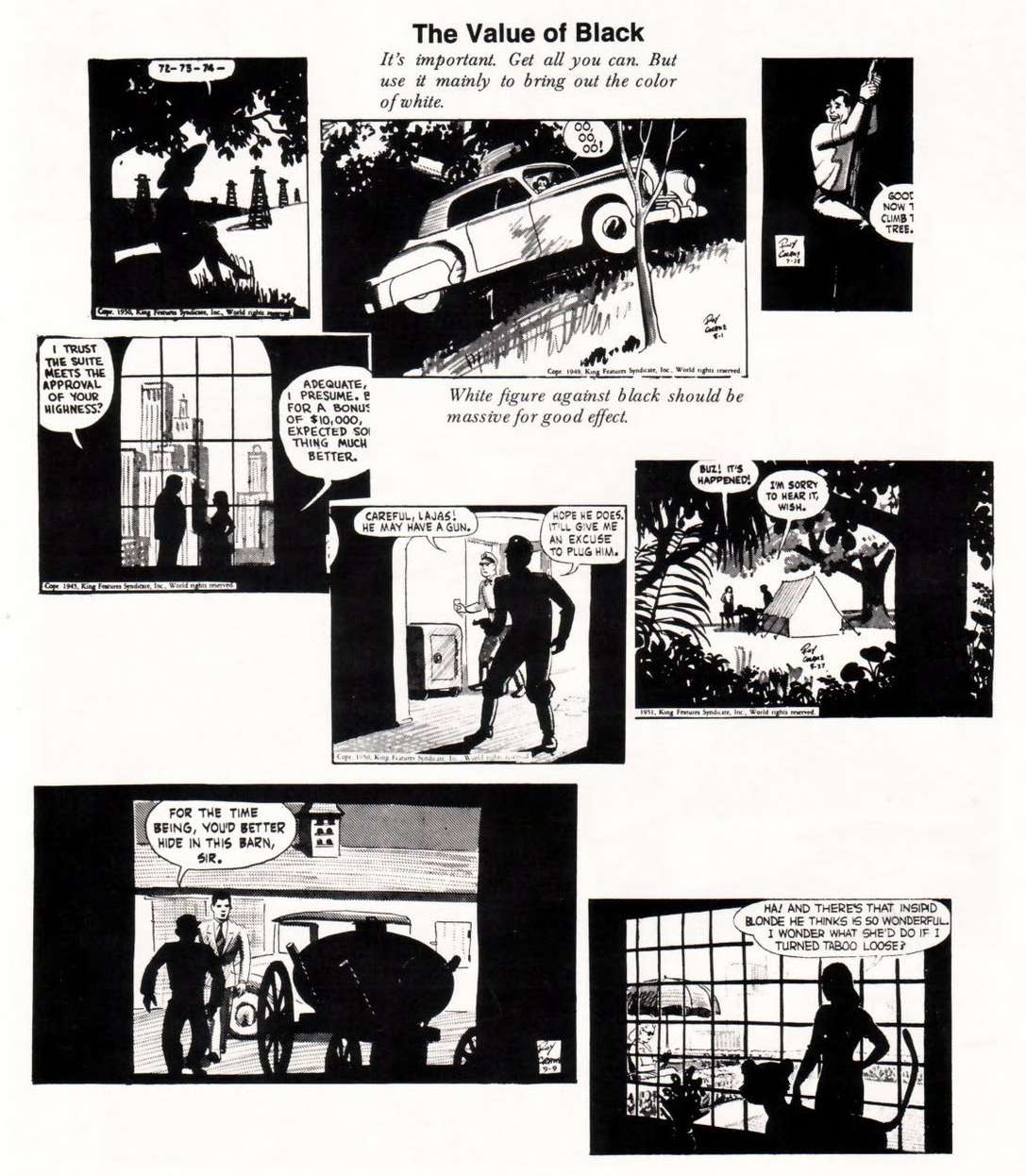
The Value of Black

Classic comic artist Roy Crane (1901-1977) reminds us of the compositional importance of black.

“Get all you can,” he said in his famous scrapbook. “But use it mainly to bring out the color of white.”


Applies to painting, too. (Rembrandt, Descent from the Cross)

Wikipedia on Roy Crane
More pages from the scrapbook at the blog "Hairy Green Eyeball."
Books: Captain Easy, Soldier of Fortune: The Complete Sunday Newspaper Strips 1933-1935 (Vol. 1) (Roy Crane's Captain Easy)

Thứ Năm, 18 tháng 8, 2011

New Yorker Blog Post


The New Yorker official blog has just shared the results of our "Unfinished Cover Contest," along with an article that tells the story of how it came to be:

James Gurney, an author, illustrator, and creator of Dinotopia, from Rhinebeck, New York, saw the blank space on George Booth’s July 4, 2011, cover and felt inspired. “I’m a fan of Booth and have always loved his drawings, but for an artist, a patch of white paper is like a red flag to a bull,” Gurney told me by phone. To the left of the dog peering out a window at a canopy of American flags, Gurney drew a second window, this one with a cat hanging from the sill. 
Doctoring magazine covers is a hobby of sorts for Gurney. “When a magazine lands on the breakfast table, I reach for the Sharpies—lots of mustaches on Mona Lisas in the house,” he said. Gurney suspected that he wasn’t the only person who did this, so, in the spirit of the Cartoon Caption Contest, Gurney decided to launch the “unfinished-cover contest,” encouraging other artists to submit their scrawls. “Five minutes after I put up the call, I started to get responses,” Gurney said. “Think of the possibilities: you could run more half-finished covers or you could run art reviews that are half-finished. I, for one, would be happy to finish columns for Peter Schjeldahl.” 
“I don’t get it,” Schjeldahl responded. “What self-respecting writers or artists wouldn’t hate the idea of anybody messing with their work? I sure do.”


Read the rest of the article.
Thanks Emily Kan


New Yorker Cover Story: "More than Mona Lisa Mustaches" by Emily Kan
Finalists of the contest.

Checkerboard Illusion Video


Here's an impressive video version of the "checkerboard illusion." The lighting conditions in the room are set up to trick us into thinking the low light is the main light in the scene, but actually the top light facing down is dominant.

The giveaway is the lack of a cast shadow of the whole checkboard table onto the floor from the purported key light. They should have painted that, too.

Thanks, Jocque

Practical Lights, Part 3

This is the third installment on practical lights, which are lights that appear inside a picture.


With imaginary subjects, we have considerable latitude in how we adjust the color balance and intensity of a practical light. For example in this scene of the sleeping barns in Dinotopia: A Land Apart from Time, I let the lamp influence a small area of Will’s sleeping basket, and then introduced cool moonlight across the forms of the sleeping dinosaurs.

This would not have been possible in an photographed scene, but it served the mood of the painting.

Thứ Tư, 17 tháng 8, 2011

Practical Lights, Part 2

Yesterday we looked at practical lights from the point of view of the plein air sketcher.

They also present unique challenges for lighting designers in movies.


In film’s earlier days (above "Mildred Pierce" 1945), film stock wasn’t as sensitive as it is today, so if an actor flipped on an electric light or lit a match, a supplemental light from outside the shot would often have to be switched on at just the right moment to shine on the actor’s face.


In an interior scene where practical lights are visible, the bulbs used (called “practicals”) are generally in the 250 to 500 watt range, and their color is whiter. Normal household bulbs are generally more reddish than other lighting instruments.


Today, more sensitive cameras and digital tools give lighting designers more flexibility. Here’s a screen grab from a film in which Gary Natrass was the Director of Photography. He achieved the natural look in the following way:


“It is lit with just two practical lights: a 100w tungsten bulb in the standard lamp and a 60w tungsten bulb in the table lamp, the fire is real and it was shot on an HPX301 AVCIntra 100 1920x1080i 25np, the camera was set to tungsten balance 3,200k.”

 Mildred Pierce set from William Miller Design
Gary Natrass on Film Production Techniques Forum
Practical Lights, Part 1

Books: Film Lighting: Talks with Hollywood's Cinematographers and Gaffers
Set Lighting Technician's Handbook, Fourth Edition: Film Lighting Equipment, Practice, and Electrical Distribution