Thứ Ba, 29 tháng 3, 2011

Value Planning

An art student recently asked me the following question:
 Dear James,
Some discussions I've been involved with lately have got me thinking about the relationship between color and value. Do you approach them as two different steps of a painting? For example some people see a well worked out monochromatic grisaille painting as perhaps the most important step in a painting, with the scumbled on color as an accentuating element. On the other hand some people have a more Alla Prima approach where they jump right into color, and create the illusion of "turning" surfaces and value directly through color mixing. How long do you spend on the monochromatic stage of a painting?
                    ---Pro Cedure.
   
Dear Pro Cedure,

You ask a very great question color and value. Yes, I do think about the value structure as a separate step in developing a studio composition. I tend to do that thinking as a preliminary step in the charcoal or pencil stage. As I'm sure you know, Norman Rockwell was the king of planning the value design first in charcoal before jumping into oil (above: "The Ferry Story" courtesy of Heritage auctions).

Whether you plan the tonal structure as a separate study (as Rockwell, Cornwell, Lovell and many academics did) or whether you establish it on the final canvas as a preliminary stage of painting, either way it really is the foundation of a good picture. Color adds a lot, but it can’t save a bad value design.

And even with a thorough planning, you can still turn forms with color temperature as you suggested in your question. Rockwell is a good artist to study for that, and I believe many of his instincts for impressionistic color effects came from his study with Charles Hawthorne.

In my case with a fantasy or historical painting, once I have figured out the tonal design in two or three values as a separate step, I begin the layin or block-in. I don’t use a monochromatic grisaille but rather a limited palette of color, such as yellow ochre, burnt sienna, and ultramarine blue. The whole step should only take an hour or two.

My goal in the preliminary block-in is to establish not only the tonal statement, but also the big warm and cool relationships and the overall color mood at the very outset of the painting process. I stay well short of darkest darks, saving those for the finishing steps of the painting.

When working on location, or when painting the figure in under two hours, I am under shorter time requirements. So I often dive right in with color, but sometimes I do a quick pencil thumbnail sketch to plan the value design.

All the best, JG
----------
Related post on GJ: The "two-streams" hypothesis of visual perception
Recommended books: "Hawthorne on Painting"
"Rockwell on Rockwell"
I also cover this material in "Imaginative Realism"

Thứ Hai, 28 tháng 3, 2011

Sky Conscious

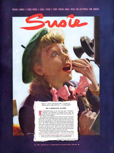
Here’s a fine head painting by the American artist Harry Anderson, known for his illustration and gallery work in opaque watercolor, (also known as tempera or gouache).

Publish Post

Rather than point out all the excellent handling of edges and drawing, I want to point out the sky behind the head. It’s a very pale, low-chroma blue, almost matching the value of the light side of the form. What’s wonderful about the sky is how it steps back and provides a setting for the interesting area of the picture. 

Harry Anderson once said, “I imagine you might say that I am definitely sky conscious,”

"I can’t tolerate skies that force themselves on the viewer’s attention. Ordinarily the sky should be a foil for the rest of the design. It must retire, but many artists fail to grasp this truth. The source of light is always the lightest area in a picture. On a bright day this is the sun itself, when a white expanse in full light might be lighter than the sky, but on a gray day the sky is the source of light, and in this instance, the sky will be the lightest note—lighter even than pure white objects.”
------
“Harry Anderson Discusses his Painting in Tempera,” American Artist, May, 1956
See more Anderson images at Leif Peng’s “Today’s Inspiration” Flickr Sets.

Chủ Nhật, 27 tháng 3, 2011

Lady Gaga, steampunk vampires, and fair weather painters

Last week, National Public Radio reported that the FBI has been reassessing its investigative methods after failing to anticipate the unrest in the Arab world. Instead of using just covert tools, they’re now turning to Google Trends, checking, for example, when Egyptians started searching the word “Tunis.”

Google Trends gives you a rough idea of what people are thinking about, based on how many times they search a topic. If you compare the graph of search volume for pop stars, it’s clear that “Lady Gaga” (orange line) has quickly risen far above either “Madonna” or “Eminem.”


All sorts of fantastic beings are hot right now, especially, “vampires.”
“Zombies” came back from the dead a few years ago, gobbling up “fairies.”


“Steampunk” is chugging steadily ahead. People run hot and cold on “plein air” painting, depending how nice the weather is outside in the Northern Hemisphere.
----------
Google Trends
NPR report

Thứ Bảy, 26 tháng 3, 2011

Piggyback Sketching

English illustrator Harry Furniss (1854-1925) related this amusing incident in The Magazine of Art in 1888.

Once while covering a political event in Birmingham, his view of the speaker was blocked by a number of very tall gentlemen.

“Although close to him on the platform, I could not, being only five feet two, see over the heads of others when all stood to cheer. I mentioned this fact to my neighbor. ‘Oh, you must not miss this scene!’ he said, and quickly, without ceremony, he had me on his back, his bald head serving as an easel.”

----
Harry Furniss in Wikipedia

Thứ Sáu, 25 tháng 3, 2011

Kalalau Valley

One of the most secluded and magical places in the USA is the Kalalau Valley on the island of Kaua'i, It's the basin visible at the base of the sheer cliffs in this 8x10 inch plein-air painting from 2000.


No roads lead to the valley. You reach it by getting a permit and and hiking in along the narrow Na Pali trail, which follows the coast.

The mountain walls rise up almost vertically from the valley. It’s inhabited by wild goats and chickens, and a few campers. At times in its history it’s been the home of a small society of people living entirely off the grid, beyond the reach of law and custom.
----
Wikipedia on Kalalau Valley 
See a photo from the same spot

Thứ Năm, 24 tháng 3, 2011

Face Contour Tip

Royal Academy instructor Solomon J. Solomon (1860-1927) offers this trick for head drawing.
 
By holding the straight vertical edge of a book adjacent to the model’s face, it’s much easier to accurately judge the far contour of a face seen in three quarter profile.
 -----
Solomon J. Solomon, The Practice of Oil Painting and Drawing. Philadelphia and London, 1910.

Thứ Tư, 23 tháng 3, 2011

Answers to your questions on "Moving Out"

Thanks, everybody for your interesting comments about the recent post “Moving Out.” It was a little experiment in form, combining a plein air study with fictional story. Sometimes I paint a house and think of it as a stage where a million private dramas are played out.


Tom, as far as the technical details, it’s in a Moleskine watercolor sketchbook, so it’s about 5 x 7.5 inches. I started with a pencil drawing and laid in an ochre undertone for the sky. I was going to going to come back with a blue wash, but forgot to, and liked it better warm.

I laid some color down over the whole surface of the paper, saving out the shining tarp and the little bit of snow by the fence, which were the lightest notes. In some of the early passes, I floated the dark tones for the windows onto wet paper to let them bleed into the surrounding tone.

Even after the first pass, the house needed to be “dirtied up” to look old. The truck was an ultramarine blue underwash with a semi-opaque light red laid over.  The tree branches are mostly drybrushed, with branches added in pencil. Mario, some of the fine lines (clapboards and wires) are drawn in with a Caran d’Ache colored pencils.

The whole sketch took about an hour and a half. In the composite at the top of this post, I stuck a photo of the subject at the right so you can see how the camera saw things. The far semi tractor-trailer in the photo was in motion during the photo. And the pickup really did leave halfway through, so I had to rely on memory to finish it up. I did all the work on location; I almost never work on a study after returning home because I feel unplugged from the inspiration.